The Municipal Development Fund of Georgia has Changed its Logotype
The Municipal Development Fund of Georgia has performed its rebranding together with the Company – branding.ge. The logotype and corporate elements of the Fund were changed. In general, the process of rebranding has involved visual aspects of the Fund – Logotype, corporate style and colors. As from now the Municipal Development Fund of Georgia will have a new logo.
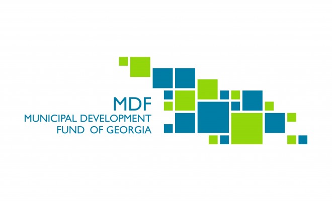
The logotype symbol was selected based on the Fund activities. Visually the new logotype brings up associations with the map of Georgia. It is well known that the Fund is carrying out sizeable infrastructural projects throughout Georgia. The concept of the new logo is visualization of development, growth and rehabilitation. The presented aspect reflects the main objective of the Fund, which lies in promotion of regional development in Georgia.
Constituent elements of the logotype, which in this case are various regions of Georgia, dynamically blend with one another and create a comprehensive whole – map of Georgia. The presented graphics gives a perception of integrated development and thereafter, the logo conveys a sense of reliability and strength.
It was of utmost importance for us to once again visibly manifest through the logotype and corporate elements that the Fund is attending to infrastructural and regional development countrywide. To this effect a new logotype was created, which will serve as a communication message for the Fund. The new logotype must become a unique sign to assist the public in identification of the Municipal Development Fund of Georgia.